Nov 2, 2010

JPEG and Raw


There are a lot of helpful articles and information available on the Internet and I’ve used a few sites to help me make the switch from JPEG to Raw format for photography. I did it and I’m happy with the results but this might not be the case for you. You might not even have a use for it.

First, I’d like to go into detail about the differences between the two and then I’ll list some helpful links for further information. Hopefully you can use that information and my experience to find out if Raw is for you.

JPEG
You have to love the .jpg. It’s ok if you don’t though. I use it almost every day when I work and have done so for years now. It’s a standard in our industry and will be for some time. Although the computer graphic field has many different image formats, JPEGs stand apart. They’re highly compatible with the internet, work great in blogs, larger in size in comparison to vector images but there are ways of down scaling the image quality to make smaller file sizes. All in all, jpegs are great.

Raw
I don’t believe “Raw” is an acronym. If I’m incorrect, please let me know but I’m pretty sure it is just the name for image type. It’s very literal. It’s a raw image that hasn’t been formatted. Allow me to explain in too much detail. When your camera (DSLR not point and shooters) snaps off a shot several things happen. First, the mirror you view through the view finder moves out of the way. Second, the lens projects the image onto a plate called an image sensor. Last, the image is recorded or exposed on that plate. There are, of course, more details if you are interested at Wikipedia. This all happens in a fraction of a second.

The image that is recorded is a very high quality representation of what the lens exposed to the image sensor. Very quickly, the camera will compress this image for size reasons. A high quality image takes up a lot of space. This image is the Raw format. It is the pure version of the JPEG that we are used to seeing. The details are visually noticeable and the quality is higher than a JPEG.

So why not just use Raw all the time?

Whoa there! Let’s not jump in with two feet forward and loose our balance. Remember the part about the compression? When it’s converted to a JPEG, the size is reduced considerably. That’s the first thing people might notice about Raw files. They’re huge compared to a JPEG. Or maybe you might notice the support issue first. Although Raw is an amazing file format, it’s hardly supported on the computer. You have to get a program just to view it. All you see is a thumbnail marker instead of an image thumbnail. That’s a big deal if you have to go through a hundred or even a thousand photos to find an image. A huge deal, because some of the software out there is very expensive (Adobe and Apple Aperture) and can slow down your computer going through multiple high-end files.

There are ups and downs to both formats. From another perspective you can say that a JPEG is only as good as the compression the camera gave you. To argue that point, you can say that Raws will eat up all your time in post production. True, but you might end up with a better looking image. Below I’ve listed a few links for more information about the topic. Enjoy your new opportunities! Or, enjoy your jpegs! What ever works for you!

Raw Image Browsers:
Adobe Bridge: www.adobe.com
Apple Aperture: www.apple.com/apreture/

Helpful information:

YouTube has a few good explanations as well. Thanks for reading! Next entry: Photo shoot at Piedmont Park.

Aug 3, 2010

CS5

I've just installed the newest version of Adobe's Creative Suite for Designer (Design Premium). First, let me start off by saying I highly recommend this product. I have been waiting, and working to save up for this product months. I'm running on a duel processor Dell Inspirion with Windows 7. It runs beautifully.

Here are the programs that are included in the suite which I use on a daily basis:
  • Photoshop
  • Flash Professional
  • Dreamweaver
  • Illustrator
  • InDesign
  • Fireworks
  • Acrobat 9 Pro
  • Bridge and Device Central
Now some of these tools I use more than others. I would say right now I'm heavy on InDesign and always Photoshop. Outside of work I'm designing logos in Illustrator and updating sites with Dreamweaver from week to week. I've back slidden from Flash even though I've read the book on ActionScript (ActionScript 2: The Definitive Guide). At the outset I was engrossed in Flash and the possibilities on the programming side. After reading and understanding how to program in Flash I found, much like 3D artwork, that it is a lot of work on one end and the result is sometimes small and overlooked.

Getting back on track. I will go over each program and review the new options I like about each one. Please note that some of these upgrades or new tools might have been introduced in CS4, as I have not worked with CS4. I use CS3 at work and still have the original CS (CS1) at home.

Photoshop
Photoshop is easily the one program out of all of these that has had the most improvement's/upgrades. The most talked about is the Content Aware addition to the spot healing brush. This tool is just plain awesome. It doesn't fix everything all the time but when used appropriately, it can really make a difference in saving time. The zoom tool has been altered but I easily got used to it in a matter of minutes. In an education video, Adobe totes that the brush size and weight can be altered using a hot + mouse action but I wasn't able to do this. Painting effects (wet, water colors) have been added or perhaps upgraded. If you have a background in traditional painting it gives the effect of adding water on top of dried water color paint. I have not been able to use this properly because it requires the use of a tablet pen. That's a $80 dollar addition if you want to see the real results for this. Edge selection (hair, grass) has been improved/added in the Refine Edge options window. 3D options were added. This is were my computer said, "No thanks." I have a decent computer but the warning window that popped up said I needed a better video card/whatever. So that feature I can't comment on.


InDesign
I use Indesign a lot. It's great for multiple page design and layout. CS5 introduced a target like symbol to objects (only images?) so that selecting images within a frame is 5 times faster. Another great feature is an enhancement added to the selection bounding box around an object (images or text too?); little gold boxes, that when selected, which control the corner style of the frame. Awesome! This is achieved in CS3 by using the Pathfinder + Convert Shape tool but now you have the ability and control over how much rounding is available. Controlling alignment and proportions is made easier with the width selection tool. Adobe also advertises and animation tool which appears to be a simple pre-formated action that moves object from right to left/top to bottom etc. Another feature is the multiple page sizes for layout. I haven't tried that yet or the interactive PDF (videos and animation come into play here). Which is strange to me because I've always thought of InDesign as a printing tool. But it's also used for Web Site layout. Something I've never tried. Sounds a little too dangerous.

Illustrator
Like I said, I'm using Illustrator for some logo designs. Advertised is a pixel grid, which I haven't tried. Also a horizon perspective tool is introduced which is something that is being brought over from Photoshop but seems more practical here. Also like Photoshop, Illustrator has art painting brushes that look very similar to Photoshop's art brushes. Again, it looks like I'll be bringing home my pen tablet tonight. There is a new tool that lets you draw behind or inside of an object. Last and I think best is the Shape Builder tool. I can't tell you how much time I've spent putting two shapes together by delleting, joining and adding verticies. Use this tool to instantly combine two or more shapes by simply drawing a line over them. Why wasn't this thought of earlier?

Flash
If you read the top paragraph you'll know that I'm a little burnt out on Flash right now. I've browsed over the additions to Flash and I'll say that it doesn't look too impressive. The only tool I see worth mentioning is the bone/ligament tool that's added to objects for manipulation. The rest if code snipets and short cuts and better import options from the rest of Adobe's programs. It's funny because if you go to the updates page for Flash you'll see a small video for "Wide content distribution" which totes flexibility for different screen sizes in device central "including the iPhone!!" HA HA HA! Adobe is super upset at Apple about it's decision to not support flash on any of it's devices.

Flash Catalyst
I suppose that my views for Flash right now are affecting my use or intrest for this program also. When I have some spare time I think I'll give it a test drive and see where it takes me.

Fireworks
According to the site there hasn't been much of an upgrade to this program...

Dreamweaver
Not too much going on with Dreamweaver. Still a really good HTML editor and great for working directly onto a server with files. One thing that caught my eye is support for Content Management Systems. This is an overlooked bonus that should have been advertised heavily. A lot of web design is moving towards CMS with systems like Wordpress, Joomla, Drupal and Ruby on Rails. I've used and work with Joomla. The support added to Dreamweaver alone is worth the upgrade but I have yet to use it.

Mar 4, 2010

Working with Layer Styles

As mentioned in my earlier blog; layer styles can really add life to a picture, text, or other design element. One of my favorite tutorials is from working with text to make over-dramatic banner size text. Using layer styles gives you the ability (in Photoshop) to change a text into a liquid like font using bevel and emboss and satin and a few other tricks. I won’t go over those specifics unless someone comments in this blog and asks for it. I will answer any questions you might have also, so please leave a comment.

Using Photoshop, I created a 300 x 300 pixel (72 rez for internet) blank canvas. I used a 70pt size, Blackadder ITC font and typed “TKP” This is, of course, for Tuckers-Photography.com. I am not using this as a logo or for any other purpose other than a learning experience.


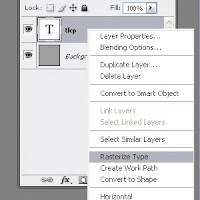
Second, I rasterized the font. In simplest terms, that means I converted the text from a vector format to a bitmap format. If you would like an explanation on the differences between the two types click here.
Fortunately, in Photoshop, this step actually isn’t required. You can add styles to a vector graphic and still see the differences.


Once the layer is ready to have styles applied to it, you should check to see that the layer is selected, then double click on it in the layers panel. A menu window will pop up.

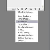
If you would like, you can also drop down a menu from the Layers tab in the right hand side dock. It looks like this.

Here you see all the options that appeared in the menu window mentioned above. Each one of these styles will manipulate the layer you have selected.

I used Outer Glow, an Inner Glow, a Color Overlay and Satin styles to come up with the following result. As you can see there are other options like Drop Shadow and Gradient Overlay. These are all very useful and I could go into detail about one but that would take too much time on your part as well as mine.

All of these styles have different parameters that can be adjusted or turned off all together [the eyeball icon underneath the layer]. I encourage you to change the settings on your own and get to know these styles as they can be extremely useful.

Thanks for reading!

Feb 24, 2010

Layers

If you haven't been working with layers yet, you are on a different level with all of the other designers in your field. Layers can be dynamic, beautiful and engaging elements that grab a hold of your viewers. So why wouldn't you use them?

Pros:
As stated earlier, it's an eye catcher. It can really add depth to a piece and turn "pretty" into "interesting."

It's not to hard to do and a lot of programs carry this option.

It can be used to incorporate two different ideas into one graphic. For instance, you could take 7 United States flags and drop them into an outline of a star. Each flag can even be a different opacity.

Cons:
It will increase memory size. Not too much though. You won't be able to see any differences in work flow unless you are using a 386. That's old PC humor...

Printing different shades of colors is different than what you see on the computer screen. But then again, a lot of print jobs hit this speed bump.

So how is it done? The concept is really simple. Imagine you have a projector; the old projectors that were used in schools back in the 1980s and 1990s. They all used plastic "films" which projected an image on the white screen using light. These films had images with certain opacity levels to let the light through.

In theory, this is the same as using layers. Layers are much like the "films" and can have different effects added to them and properties as well. Photoshop offers a lot of special effects and layer blending modes. Most Adobe software programs have layer options, even After Effects uses them.

Once you have the layers concept you can move on to layer effects and blending modes. This will change what you are able to do in Photoshop. Adding a gradient to a graphic layered on top of a background will look amazing if done correctly. In summary: learn what you can and practice layers. And do it often.

Feb 17, 2010

Rounded Corners Part 2

In the first tutorial we went over how to use an action to create rounded corners in Photoshop. The action used 6 guides to create a grid and then formed a selection with one rounded edge and 3 sharp corners. From there you can simply copy the layer 3 times and form a box with all 3 rounded edges. It can be a perfect square or a rectangle, but beware: once you have form the box there is a trick to editing the size.

Lets say that you have created a rectangle with the 4 layers of rounded corners. Then you merged the layers together and used it in your design. As always, your client will want to change something and give you 3 more sentences to fit inside the rectangle. The normal reaction would be to transform (cntrl + T) the rectangel. DO NOT DO THIS. If you transform the merged cornered box the rounded edges will "warp" or sag. I will now go over how to correctly and quickly transform the rectangle instead of using the free transform tool.

Select the rectangular marque tool (M). Use the marque tool to cut the box in half by simply selecting half of the box and then select the Move tool (V) while the box is still selected. Nudge the selection to the right or left or grab it and move it. If you would like to keep it clean, hold down the shift key to keep the two halfs aligned. Now you have a large gap in the box. Not a problem at all. Use the marque tool again to select a flat section of the box (not the rounded portion!) and again select the Move tool. Now you will use the transform option (cntrl + T) and stretch the selection without warping the edges.

Now that you have rounded edges, you can make pill sized jelly buttons or content windows. I'll leave jelly buttons for a different tutorial.

Feb 10, 2010

Rounded corners – Part 1

A lot of sites and even some printed advertisements are using rounded edges for content. It can be extremely useful and adds a lighter sense to a design overall. Illustrator and Flash both have rounded square tools that are very helpful but unfortunately Photoshop does not. There are a few ways to go about getting the effect in Photoshop and the simplest way, I just read from [www.tutorio.com/tutorial/photoshop-round-corners] is to make a selection with the square tool and then refine the edge [select-refine edge] smooth parameter to full. This creates a nice effect but the corners are blurry.
I also found that one can make a rounded edge using the pen tool to create a path but I do not prefer using vectors in Photoshop. Since I am going for speed and the way I use is lengthy and slow but creates a smooth, rounded edge. I manually pull out 6 guides, equally spaced from each other to create a perfect square. I use these guides to form a perfect circle [shift + drag] and then I add box selections to the right and bottom of this circle. This will give a rounded corner of a box. And since this can take a whole 10 minutes, I decided the best practice is to use the actions feature of Photoshop.
I am not including a link on this site to the Actions Set download. Please visit www.tuckers-photography.com for more information. See the Journal page.
Although the scope of this tutorial does not cover ‘Actions’ in Photoshop I highly recommend it for everyone using Photoshop. Learn it, love it and deploy it for amazing results. After you create a few actions of your own, you will understand the power that is nested in this tool. If you work with multiple files or want to re-use a workflow, Actions is extremely valuable.
To use the set of actions, you must install it in your actions folder. I am using a PC, so everything you see is set for PC but a Mac will put this folder in a similar place. Find the “Program Files” folder [may be different for a Mac] and then look for the “Adobe” folder inside. Inside the “Adobe” folder, find the “Adobe Photoshop CS 2/3/4” folder. Inside that folder you will see a “Presets” folder. The “Presets” folder contains a “Actions” folder.
You should now be looking at a number of files that end in ‘.atn’ These are Action sets or folders. These sets appear in Photoshop in the Actions panel but you must first load them in the actions window. Click on the actions window options; see example.
From the drop down menu you will see a group of sets at the bottom. That’s were you set should show up but Photoshop needs to be reset in order to see the folder. Restart Photoshop and you will now see the set if your repeat this step.
Open a file, 300 rez with at least 3 inches by 3 inches. Run the action in the new folder you see. Viola!

Please post a comment if you have any questions.

Feb 8, 2010

Site Update

I am very pleased to announce the finish of my website. There are still some pages that have the dreaded “yellow sign” and need to be finished, but for the most part, the site is now origin specific. No more giant Joomla! logo at the top. The HTML has the correct title in it. There are custom banners at the top. I am happy and all is right with the world.

It did take a bit of time to get it just right. I had some setbacks: a template issue, browser compatibility bugs, and some CSS cleaning. The writing took up most of my time and I still have to proof read the sections. So I still have a lot of work, but I am glad to have the monster off my back.

I will be writing a design tip next for the journal and trying to get the tips I have here in this blog on the site. No more “under construction” blog posts.

Feb 4, 2010

Site Update

I have made a lot of progress with the CMS (content management system) for my site. The load time was cut in half by removing the items that were mentioned in an earlier post. It is about 4/5 seconds now and I will continue to reduce this by shaving some HTML code out of the main template page.

A lot of content was added and the banner was fixed. The banner is tricky and I added more height to it so that I can have better pictures in each banner. It is a random selector which is what I would like. I do not want the same banner in the same section time and time again. In fact, in the future, I would love to just upload new banners and have them display randomly making the site more dynamic as a whole.

I have not researched the shopping cart yet. I also took off the “log in” module which I will have to replace. I feel a lot better about Joomla! now that I have some experience with it. I was very, very close to purchasing a template to spice up my site but after reading further at Joomlashack.com I found that purchasing a template doesn’t include the right to use it on your site.

That’s just bad business. I won’t be using these tactics with my photography and I advise anyone that is starting up a web site or editing/redesigning an existing site, be careful with these people who sell their add-ons and extensions. Their site may look wonderful and have a forum and all sorts of bells and whistles, but there is no real way of knowing if it is legitimate.

Feb 1, 2010

Site Update

My new CMS is extremely slow. It takes about 7 to 8 seconds for the page to load which is too long. I will most likely be removing a lot of the modules to adjust this problem and hopefully that will eliminate the issue. It’s very hard to tell how the site works with all the PHP content. HTML and CSS is easy to change with Joomla! so I’m happy for that. I will be using a custom background repeat image and color combination and I hope to have that updated by the end of the week. I also would like to have the navigation with content for each category [pages?] if possible by halfway through next week. This will help me with my portfolio before Presidents day.

Jan 30, 2010

Construction Update

I am pleased to announce that the content management system (CMS) is now properly installed on my site. A database has also been set up to accompany the site. This will allow for better content management as well as ease of use and dynamic features. I plan to have restricted areas for any content I wish to sell, such as logos or even templates. This area will also play a role in selling photography!
I will be researching the extensions and shopping cart options next, but in the mean time I have to figure out how to customize and redesign the look of the default settings. I'm really excited because I had a rough time trying to set up the database. Webhero.com and Joomla.org both helped and I am glad I was able to make a dynamic site. Finally!

Jan 28, 2010

Photo Shoot


I went to a basketball game to take some photos for a client. The client is only doing pro bono work with me at this time and I see this as an investment in experience. The photos are of him and the mascot of his business interacting with students at the game.

I took some time to get some shots of the players as well, and found it very difficult to get the timing right. First, it was too hard to watch the players through the lens, so I opened both eyes and concentrated on the left eye. I got used to that quickly but the timing and lighting was also an issue. I started taking shots just before a player would release the ball and when they were running also.


I do not intend to sell these images, copywrite applies.

Jan 26, 2010

Finished Project

Client: PulseVet Technologies

I finished up an old project that was waiting on changes for 2 months and I also finished the design (not final) for a 2 fold pamphlet. Both print jobs are based on a standing blue/light aqua blue-graidant background. Both contain text with multiple sets of bullet lists. The graphics used are from stock photography and can be found at www.shutterstock.com.

The theme was created for their convention booth by another company. The name of the company that created the look is Blue Sky Exhibits. It has the gradient with horse and canine images masked out in circles. White outlines, text and pointers are used along with wavy shades of the blue and aqua used in the gradiant. It was easy to re-create with InDesign and Photoshop. I also had to incorporate some of their product shots with a silver background.


I think I will be going over the time limit that I had alloted for this project but I am still happy with the results.

Images and work are property of PulseVet Technologies.

Jan 22, 2010

Design Tip: Mirror Images

When I mirror an image, either in Photoshop or Illustrator, it is usually to help fit another element into the design. It is extremely useful when adding other images or to help balance out text. It is also very simple to do and you can get the hang of it quickly.

I found an image today [from "http://magento-themes.joomlart.com/jm_mesolite/"] that has been altered and mirrored. It may be because the site graphics person is concerned about copy write infringements or perhaps it was over looked for another purpose.

The image was simply flipped horizontally. This can be done through the 'Free Transform' mode. To use the 'Free Transform', from the menu, choose 'Edit', 'Free Transform' or use the hotkey "Ctrl-T." While you are in transform mode, left click and select the 'Flip Horizontal' option. After you are finished, check to make sure text or other items that belong on certain sides is correct. In this case, the Macintosh symbol was flipped.


Jan 21, 2010

JavaScript Quick Solution

Below is a solution I programmed for my company's site at work. It involves redirecting the viewer to a warning page if the cookie is not recognized along with an alert pop up window. If the cookie is read, the viewer is taken to the actual content page.
Unfortunately there is no way in Blogger to separate the text and the HTML is limited so I was restricted and changed out all the greater than - less than symbols on the tags. Same with curly brackets.

[script language="JavaScript" type="text/javascript"]
if (document.cookie < 1)
[
var cliff = new Date();
cliff.setDate(cliff.getDate() + 1);
document.cookie = "International = Warning; expires =" + cliff.toGMTString() + " ; " ;
alert("You are about to enter a section of the website that has material and products that are not approved by the FDA. Products are not available for sale in the US.")
]
else [
window.location = "../international/INT_dermapaceAPP.html"
]
[/script]


Design Tip: Dividing the Workspace Using Guidelines


When working in most graphic editing programs, one is given the ability to align align align. It is one of the fundamentals of the four concepts of design: Color, Repetition, Alignment and Proximity. I think the last two stand out the most for me and it’s important to understand as well as incorporate these concepts into design.

I would like to point out that I am, in turn, speaking about design and not art as a whole. Art to me does not necessarily have to be balanced, but in a good design, I was taught to balance everything, even in terms of contrasting sizes or color. I have noticed over the years that more and more people require and request balance in most of the work I do.


Now consider the alignment guides that are used in Photoshop, Illustrator, and InDesign and other programs. When using proportions, lets say; in terms of equal distances for a pamphlet we need to divide the page equally. A handout style pamphlet traditionally has 3 sections on each side and therefore 2 folds. These two folding lines are where we would like to place our guides [or guidelines] to equally divide 3 sections. If you take 11 inches and divide by 3, you come up with 3.6666 . . . so there is a dilemma.

The solution is quite easy but for some reason it took me a very long time to notice it: Add additional guidelines, to serve as markers at the end of the page, and within these (outermost) guidelines we can equally distribute the other guides. Just take the outer most guides, line them up with the page’s edge. Then select all the guides together and select the “Horizontal Distribute Center” button shown in this graphic.


Hope this was helpful to anyone who works with a lot of layout!

Jan 20, 2010

Site Under Construction

I have decided to re-design my website. It has minimal content and it doesn't function as well as I would like it to. The theme is photography, obviously, however I would also like to promote my ability to design and encode websites as well. I believe that I need to review my portfolio and include a lot of the work that I've done over the last 3 years. This will include the work I've done with SANUWAVE as well as freelance work on the side for PulseVet and Premier Shockwave.

Taking into consideration that my site will not satisfy a curious customer coming from a free lance site, I am going to look into a free CMS solution for the layout of
www.tuckersphotography.com. After the layout is fixed, I can worry about the content management and even possible dynamic content.